Color Made Simple: Tips for Every Room in Your Home
Choosing the right colors for each room in your home can transform your living space and reflect your personality. The colors you select don’t just look beautiful—they can influence mood, energy, and even behavior. Whether you want a serene retreat, a vibrant gathering spot, or a productive workspace, understanding how color works can guide your choices and make your home feel effortlessly “you.”
Understanding Color Psychology: How Colors Shape Your Home and Mood
Color psychology is the art (and science!) of how colors influence the way we feel, act, and interact with others. It’s more than picking a favorite hue—it’s about creating spaces that support your lifestyle and elevate your daily experience.
-
Cool Colors for Calm and Focus: Blues, greens, and soft purples evoke relaxation, focus, and mental clarity. Ideal for bedrooms, bathrooms, and offices. Imagine sinking into a soft blue bedroom after a long day—it’s instant serenity.
-
Warm Colors for Energy and Connection: Reds, oranges, and yellows stimulate activity, conversation, and appetite. Perfect for kitchens, dining areas, and family rooms where energy and social connection are key.
-
Neutrals as the Unsung Heroes: Whites, grays, and beige tones act as versatile backdrops that balance bolder accents. They create harmony and allow furniture, art, and textiles to shine.
-
Accent Colors for Personality: Use accent walls, trim, or decor pieces to inject your personality without overwhelming a space.
-
How Color Affects Behavior and Mood: Did you know your kitchen’s color can affect appetite? Reds and yellows can increase hunger, while soft greens and blues promote calm. Even your bedroom color can influence sleep quality!
-
Layering for Depth: Combining warm and cool tones creates dynamic, multidimensional spaces. A gray living room with warm orange accents, for instance, can feel cozy yet energized.
"Color doesn’t just decorate a room—it sets the vibe. The right shade can make you feel calm, energized, or totally at home."
Room-by-Room Color Picks
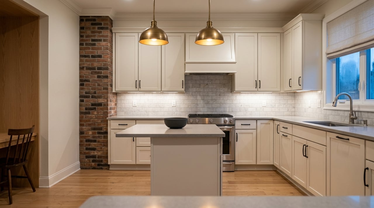
🍳 Kitchen: Energize & Entertain
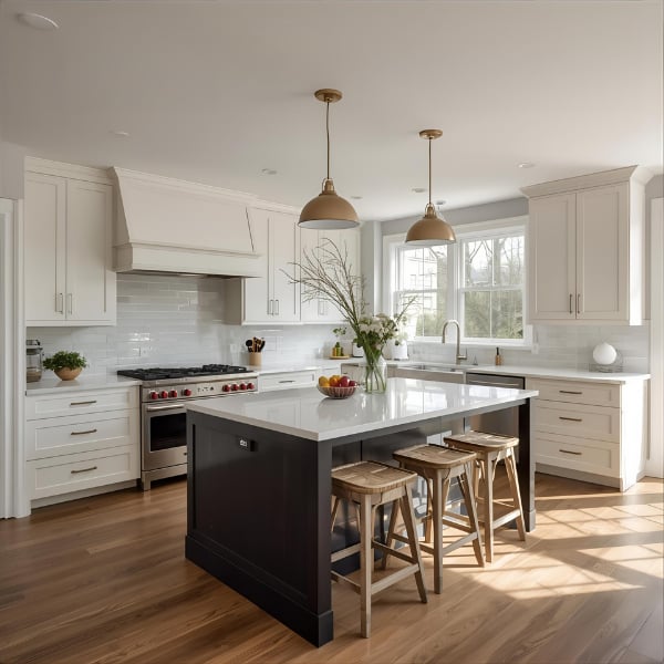
Where flavor meets flair—and every meal comes with a side of style!
Your kitchen isn’t just where meals are made—it’s where memories are cooked up, conversations flow, and friends and family gather. Choosing the right colors can make this space feel inviting, vibrant, and full of life.
✅ Warm tones like soft reds, sunny yellows, or muted oranges stimulate appetite and conversation—perfect for a lively family hub.
✅ Cool tones like crisp whites, soft greens, or pale blues create a clean, fresh, and calming backdrop for cooking and entertaining.
✅ Painted cabinets: Cabinets are the perfect canvas—try deep navy, classic teal, soft sage, or even a crisp white for a fresh, modern vibe. Painted cabinets let you make a big impact without committing to a full renovation.
✅ Bold accents: A colorful backsplash, painted island, or even just the cabinet doors can inject personality and fun into the room without overwhelming the space.
✅ Metallic touches: Gold, copper, or brushed nickel paired with your paint colors can add shine, elegance, and a touch of sophistication.
💡 Fun Fact: Color can actually influence how hungry or satisfied you feel while cooking and eating! Warm tones stimulate appetite, while cooler greens and blues can have a calming effect—so your kitchen palette can subtly shape the vibe at mealtime.
✨ Design Tip: Painted cabinets are a game-changer—they allow for bold color choices while keeping the rest of your space neutral and balanced. Plus, repainting cabinets is far easier than replacing them, making it a perfect way to refresh an older kitchen or test a new trend.
💡 Extra Tips for a Balanced, Beautiful Kitchen:
-
Pair bold cabinet colors with neutral walls or countertops to keep the space feeling open and fresh.
-
Mix textures: matte cabinet finishes with glossy backsplashes or metallic hardware add depth and interest.
-
Lighting matters: natural light enhances bright and warm colors, while layered lighting (pendants, under-cabinet, and recessed) can make darker tones feel cozy rather than heavy.
-
Small accessories like colorful stools, dishware, or artwork can echo your main colors, tying the room together beautifully.
✨ Mood Magic: Thoughtful kitchen colors can do more than just look good—they can energize, inspire creativity while cooking, and make family mealtime feel even more special.
🛏 Bedroom: Relax & Recharge
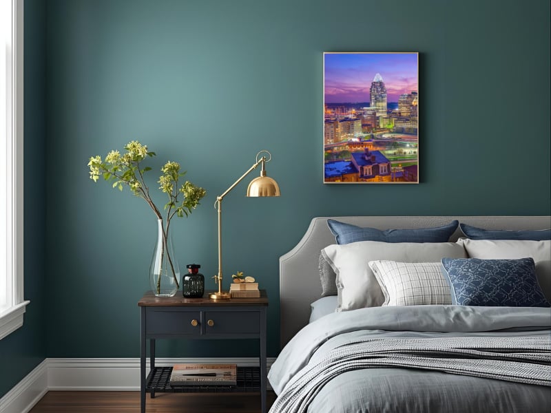
Creating a serene sanctuary one shade at a time.
Your bedroom should be your sanctuary—a place to rest, recharge, and wake up feeling refreshed. Color choices here are especially important because they set the tone for relaxation, focus, and even mood.
✅ Opt for calming shades like soft blues, muted greens, or gentle grays to create a serene environment.
✅ Introduce teal to add depth, sophistication, and balance; it pairs beautifully with neutral bedding or furniture for a space that feels peaceful yet stylish.
✅ Consider layering colors: lighter shades on walls, medium tones on furniture, and darker accents in décor can create dimension and coziness.
💡 Fun Fact: Teal combines the calming energy of blue with the revitalizing qualities of green. This makes it perfect for creating a bedroom that feels both restful and rejuvenating.
✨ Design Tip: Use teal on an accent wall, throw pillows, blankets, or decorative accessories for a pop of color without overwhelming the space. Its medium saturation gives personality while still promoting relaxation—a win-win for your bedroom retreat.
💡 Extra Tips for Bedroom Bliss:
-
Lighting complements color: soft, warm lights enhance soothing tones, while natural daylight keeps the space airy and inviting.
-
Mix textures: plush rugs, soft linens, and layered pillows bring warmth and dimension, making the bedroom feel luxurious and cozy.
-
Personal touches: artwork, plants, or small decor items in complementary hues can tie the room together and make it feel uniquely yours.
-
Balance is key: combine muted tones with strategic pops of teal or other accent colors to create a peaceful yet visually engaging space.
✨ Mood Magic: Thoughtful bedroom colors can do more than decorate—they can calm your mind, energize your mornings, and make winding down at night feel effortless.
🛁 Bathroom: Refresh & Revitalize
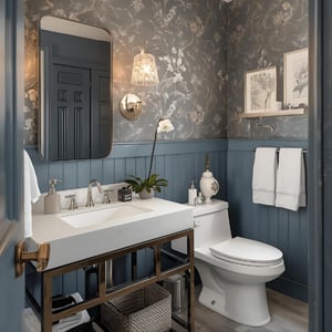
Small or large, make your bathroom feel luxe with the right colors.
Bathrooms are the perfect spot to experiment with color and create a personal retreat. Whether you have a cozy powder room or a spacious ensuite, the right palette can set the tone for relaxation and style.
✅ Small Bathrooms: Light, airy shades like pale blues, soft greens, or creamy whites reflect light, making the space feel larger and more open. Don’t be afraid to introduce one dark or moody accent wall—navy, charcoal, or deep teal paired with mirrors and metallic fixtures adds sophistication without overwhelming the space.
✅ Large Bathrooms: Bigger spaces can handle richer colors and bolder choices. Deep greens, moody blues, or even jewel-toned walls create a spa-like ambiance, while lighter accents on tile, cabinetry, or textiles maintain balance and brightness.
✅ Neutral & Crisp Looks: Crisp whites with colorful accents or natural wood elements feel fresh and spa-like, perfect for a clean, timeless aesthetic.
✅ Creative Pops of Color: Removable wall decals, artwork, or patterned tiles allow for seasonal or playful color changes without a permanent commitment.
💡 Fun Fact: The color in your bathroom can affect how relaxed or energized you feel! Cool tones like blues and greens promote calm and rejuvenation, while warmer accents can create a subtle sense of energy.
✨ Design Tip: In small bathrooms, balance dark hues with reflective surfaces and lighter walls to avoid feeling cramped. In larger bathrooms, bold, moody walls can make a luxurious statement while still keeping the space airy with light accents and textures.
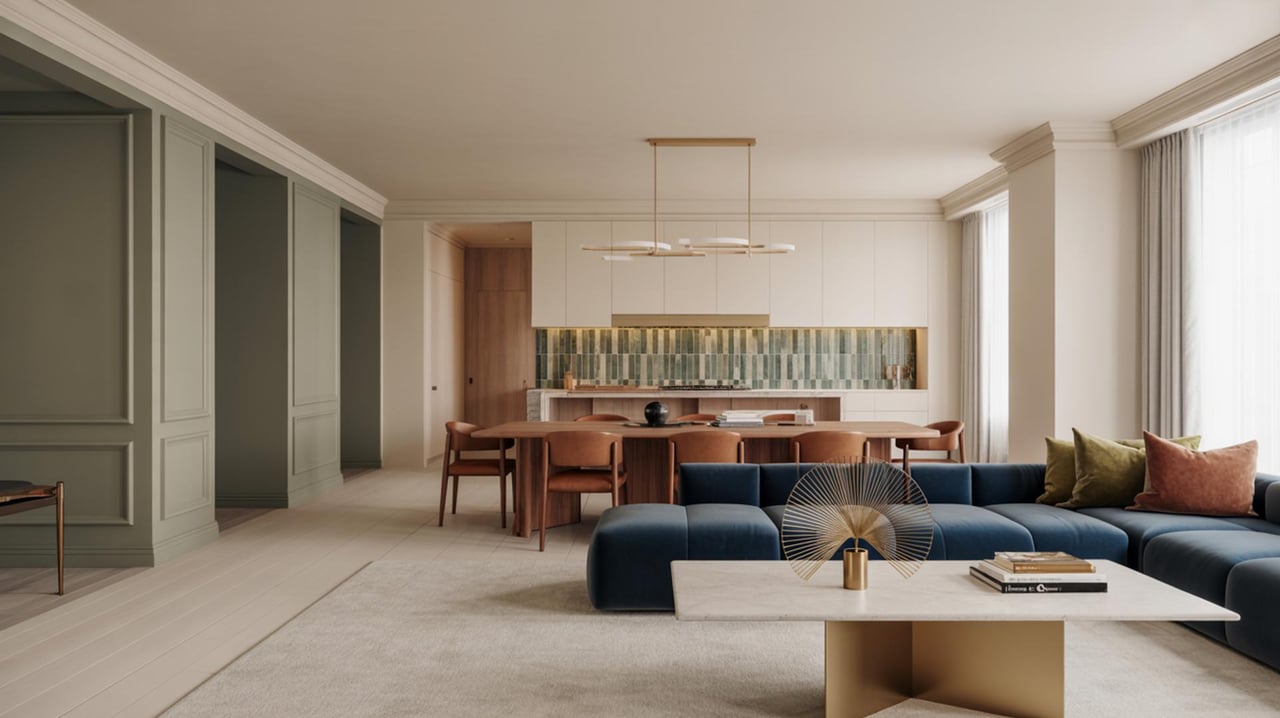
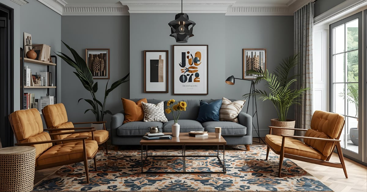
🛋 Family Room & Living Room: Gather & Connect
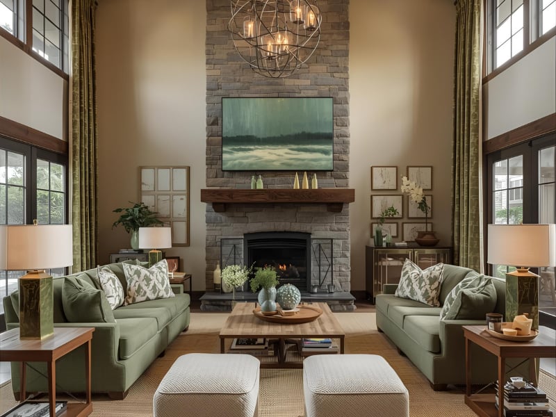
Make your living space feel both lively and relaxed with the perfect palette.
These social spaces benefit from colors that energize, invite conversation, and make everyone feel at home. After all, your living room isn’t just for TV—it’s where you host friends, bond with family, and create lasting memories.
✅ Warm neutrals and earthy tones make the space feel cozy, welcoming, and versatile for any décor style.
✅ Deep blues or rich greens add depth, sophistication, and a calming backdrop for lively conversations or relaxing evenings.
✅ Accent walls, rugs, or pillows in brighter hues can energize the room without overwhelming the senses.
💡 Fun Fact: Warm tones in living spaces can subconsciously make guests feel more sociable and engaged—perfect for entertaining or family gatherings!
🎨 Pro Tip: Remember—"The right color can transform not just a room, but the way you feel within it." Use this as your guide when picking hues for spaces where family and friends gather.
💡 Extra Tips for a Cohesive Look:
-
Mix textures and finishes alongside your color choices to create a layered, inviting environment (think velvet cushions on a neutral sofa, a patterned rug over warm wood floors, or metallic accents for subtle shine).
-
Consider color saturation: muted tones create a relaxed vibe, while more saturated colors bring energy and visual interest.
-
Lighting matters: natural sunlight makes colors feel brighter and more cheerful, while warm artificial lighting enhances coziness in deeper tones.
-
Add pops of personality: artwork, decorative items, or colorful throw blankets let you experiment with bold hues without committing to full-room paint.
✨ Mood Magic: Choosing the right palette can make your living spaces feel perfectly balanced—energizing enough for conversation, yet soothing enough for quiet, cozy nights in.
💼 Home Office: Focus & Inspire
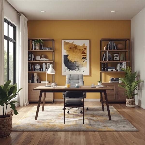
Design a space that motivates every workday.
Your workspace should do more than just hold a desk—it should keep you motivated, creative, and energized throughout your workday. Choosing the right colors in your office can influence focus, productivity, and even your overall mood.
✅ Soft blues and muted greens create a calming atmosphere, helping you concentrate and reduce stress during long work sessions.
✅ Neutral tones like gray, beige, or soft white provide a versatile, timeless backdrop that lets furniture and accessories shine while keeping the space feeling clean and professional.
✅ Mustard yellow accents—whether a painted wall, an accent chair, or decorative pieces—add a burst of energy and creativity without being overwhelming. This color subtly promotes optimism and sparks innovative thinking.
✅ Pops of warm or bold colors in accessories, artwork, or shelving can break monotony, energize the room, and help maintain motivation throughout the day.
✅ Layer textures and finishes alongside your color choices—like natural wood desks, metallic accents, or soft textiles—to add dimension and make the office feel inviting rather than sterile.
✅ Accent walls and functional color zones: Use color strategically to define different areas of your office, like a bold wall behind your desk to create a focal point or a softer hue in a reading corner to encourage relaxation.
✅ Lighting matters: Pair your colors with natural or adjustable lighting to enhance mood and focus. Colors can look different under warm vs. cool light, so experiment before committing.
💡 Mood Magic: “Color doesn’t just decorate a room—it transforms your day. The right shades can lift your spirits, boost creativity, and keep you energized from morning to evening.”
💡 Fun Fact: Mustard yellow is known to promote optimism and spark creativity, making it ideal for spaces where focus and inspiration are key. Pair it with blues, greens, or natural wood tones to keep your office grounded, productive, and full of personality.
✨ Pro Tip: Don’t forget about color saturation—lighter shades keep the room feeling open and airy, while deeper tones can make the space feel cozy and focused. Experiment with a mix to see what energizes you the most.
Final Tips for Color Success
Test Before You Commit: Always try before you buy! Paint samples on your walls to see how colors look at different times of day and under various lighting. Natural light can make a color pop, while artificial lighting can warm or cool it. For an even easier option, check out Samplize (samplize.com) or Sherwin-Williams (sherwin-williams.com), where you can order pre-painted swatches to place directly on your wall—no guesswork required. Seeing the color in your actual space ensures you love it before committing to a whole room.
Balance Bold and Neutral: Bold colors are exciting, but too much can overwhelm a space. Use them strategically—on an accent wall, cabinetry, or through accessories like pillows and rugs. Pair bold shades with neutral tones to let the color shine while keeping the room feeling grounded and inviting.
Cohesive Flow: Think of your home as a visual story. Keeping a unified base palette throughout the rooms creates a sense of harmony and flow. Then, introduce accent colors to give each space its own personality without making the home feel disjointed. A thoughtful, cohesive palette makes moving from room to room feel natural and effortlessly stylish.
💡 Pro Tip: Don’t be afraid to mix finishes and textures along with your color choices—matte, glossy, or satin surfaces can change how a hue feels, while fabrics and décor items add depth and warmth.
Transform Your Home with Color
Choosing the right colors for each room can truly transform your home, reflecting your personality while supporting the mood and function of each space. Color isn’t just decoration—it’s a tool that makes your house feel like home.
Our team at The LIVIN’ IN CIN Experience is here to guide you every step of the way—with a friendly, supportive approach that makes your home journey feel less stressful and more exciting. While we’re realtors first, we love helping you see the potential in your space and make confident choices that bring your vision to life. A well-styled, thoughtfully colored home isn’t just beautiful; it’s a space that feels truly yours, where every room reflects your personality and enhances your daily life.